To learn how to create a feature control frame using the General tab of the Feature Control Frame dialog box, see the Help topic, Define feature control frame content.
Saved settings
Lists saved frames. You can access the saved frames by selecting them from the list. The settings on the dialog box display the characteristics of the frame you select. You can type a name in the box to name a group of settings.
Save
Saves the current settings to the name you type.
Delete
Deletes the selected saved setting(s).
Content
The four boxes in this section specify the feature control frame content. The box in the first row defines the content of the top row of the feature control frame. You can use the second, third, and fourth boxes to specify additional rows in the feature control frame structure.
Note:
Blank rows are not displayed.
Composite
Selecting any of the three Composite check boxes activates a composite frame between the row where the box is checked and the row above it.
Example:
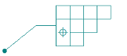
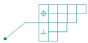
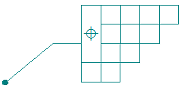
Following are three composite feature control frame structures. The information in the first three columns explains how to generate the frame in the last column. The vertical lines are entered using the Divider symbol button, which you use to separate a row into compartments.
|
FCF Rows |
Composite |
Content box |
This structure is displayed |
|
(Row 1) |
N/A |
%PO|||| |
|
|
(Row 2) |
|
||| |
|
|
(Row 3) |
|
|| |
|
|
(Row 4) |
|
|| |
|
FCF Rows |
Composite |
Content box |
This structure is displayed |
|
(Row 1) |
N/A |
||| |
|
|
(Row 2) |
|
%PO|| |
|
|
(Row 3) |
|
| |
|
|
(Row 4) |
|
blank |
|
FCF Rows |
Composite |
Content box |
This structure is displayed |
|
(Row 1) |
N/A |
%PO|||| |
|
|
(Row 2) |
|
||| |
|
|
(Row 3) |
|
%PP|| |
|
|
(Row 4) |
|
| |
Divider
Places a dividing line between the individual compartments in a feature control frame. For example, you should place a divider between the primary datum and secondary datum compartments.
Symbols and Values
Opens the Select Symbols and Values dialog box for you to generate the appropriate symbols and model-derived values without having to type the property text codes yourself. Examples of the types of symbols you can select include ± (plus minus), ° (degree), and ∅ (diameter). Examples of model-derived values include hole references, bend data, and weld beads.
Geometric symbols
Displays the geometric symbols that you can place in a feature control frame. To see what the geometric symbols represent, pause the cursor over each button. Click the button for the symbol you want to insert in the Content box.
You can select the geometric symbols for Flatness, Straightness, Circularity, Cylindricity, Perpendicularity, Angularity, Parallelism, Profile of a Surface, Profile of a Line, Circular Runout, Total Runout, Position, Concentricity, and Symmetry.
Material conditions
Displays the material condition symbols you can place in a feature control frame. To see what the material condition symbols represent, pause the cursor over each button. Click the button for the symbol you want to insert in the Content box.
You can select the material condition symbols for Maximum, Least, Regardless of Feature Size, and Reciprocity Condition.
Tolerance zone
Displays the tolerance zone symbols you can place in a feature control frame. To see what the tolerance zone symbols represent, pause the cursor over each button. Click the button for the symbol you want to insert in the Content box.
You can select the tolerance zone symbols for Projected, Tangent Plane, Free State, Envelope Requirement, and Profile Unequally Disposed.
Other
Displays other symbols you can place in a feature control frame. To see what the symbols represent, pause the cursor over each button. Click the button for the symbol you want to insert in the Content box.
You can select special symbols for Diameter, Degree, Between, and Statistical Tolerance.
All around symbol with leader
Displays the all around symbol on feature control frames placed with a leader.
You can change the symbol size using the All-around symbol size edit box on the Text and Leader tab.
All over symbol with leader
Displays the all over symbol with a leader line on the callout. This option is not available when the All around symbol with leader check box is selected.
You can change the symbol size using the All-around symbol size edit box on the Text and Leader tab.
Show this dialog when the command begins
When set, displays the Feature Control Frame Properties dialog box automatically when you select the Feature Control Frame command. When cleared, you have to use the Properties button on the command bar to open this dialog box.
The default is to show the dialog box.
Preview
Shows you the result of your settings before you apply them.