The Columns tab is where you define the column content and header content for each column in a model-derived table, a parts list, or a block table. You also can specify the display format of each column, and the order that the columns appear in the table. To learn how you can use these options, see the Help topic, Using the Columns tab.
Columns
Lists the columns currently defined in the table. This also shows the order in which the columns will appear.
Note:
All of the other controls are based on the currently highlighted column in this list.
Move Up
Moves the selected column up one position in the Columns list.
In the table, this has the effect of moving the column to the left.
Move Down
Moves the selected column down one position in the Columns list.
In the table, this has the effect of moving the column to the right.
Add Column
Adds the property type selected in the Properties list to the Columns list.
Delete Column
Removes the selected column from the Columns list and from the table.
Properties
Lists all of the available properties. Properties derived from a model typically include:
Model document properties, such as file name, file size, company, document number, and author.
Properties defined in the files referenced by the parts list, for example, material type and material properties.
Standard parts list properties: item number, quantity, cut length, total length, item mass, quantity mass, and miter angles.
Standard bend table properties: sequence number, acute angle between faces, outside angle, bend direction, radius, and feature.
Custom properties defined on the Custom tab in the File Properties dialog box.
Select the User Defined property to create a column with no predefined text.
To learn more, see Creating a custom column definition.
Column Format
The following options control how the column highlighted in the Columns list appears in the table or parts list.
Show Column
Shows or hides the selected column.
Column Width
Sets the width of the selected column.
Headers
The options in the Headers section define the general characteristics of all column headers in the table.
Show Header
Shows or hides the column header on the column.
Position
Specifies where to display the column header:
Header: At the top of the column.
Footer: At the bottom of the column.
Both: At the top and bottom of the column.
Neither: Not displayed.
Fixed header row height
Specifies that the header row maintains the height entered in the box at right. This is independent of text height.
This option affects all headers in the table.
When columns are displayed with a two-row header, the height of each of the rows is the value specified by the Fixed header row height box.
When column headers are displayed with a combination of single and double rows, the single-row column headers are the same height as the combined, two-row column headers.
Number of rows
Specifies the total number of header rows for all table columns. The default number of header rows is one. You can have up to five header rows.
Example:
In the following example, there are four header rows, which are shown in blue. Row four is the row that is adjacent to the column data.
Column Header
The options in the Column Header section define the content and merging of the header for the currently selected column.
Text row
Identifies the working header row number for the purpose of defining content in the Text box, changing cell alignment using the Format Table Cells dialog box, and merging headers across multiple columns.
Text
Specifies the header text for the column. The default header is the same as the selected property. You can type in this box to change it.
You can create multiline headers using the Enter key.
Merge with next horizontal cell
Merges column headers horizontally across multiple columns. Use this option to merge two or more adjacent headers into one.
Columns are merged from left to right, in the order that they are displayed in the table. The formatting of the first column with the Merge with next header box checked controls the appearance of the merged columns.
For examples, see Formatting columns and data cells.
Merge with next vertical cell
Merges column headers vertically across multiple rows.
Use this option to merge a header cell on the current row with the adjacent header cell on the next row.
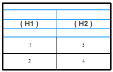
Example:
You can use the two Merge with options to arrange column header cells (H1) and (H2) differently for each column.
Format Cells
Opens the Format Table Cells dialog box for you to specify the text alignment and orientation of the currently selected header cell in the currently selected column.
Column Data
The following options define the content of the currently selected column.
Fixed data row height
Specifies that the data cells in the column maintain the height specified in the box at right, and that they do not change height when the text height changes.
This affects all data cells in the table, not just the current row or current column.
Add Property
Adds the property text code displayed in the Property text box to the content definition for the column that is currently selected in the Columns list.
Property text
Specifies the property text definition in the currently selected column.
When you select a column, the property text code that is used to fetch the data is displayed in the Property text box.
You can add more property text to the default column definition by also selecting a property from the Properties list, and then selecting the Add Property button.
You can concatenate property text strings by selecting and adding individual Properties, one by one, using the Add Property button.
You can paste copied property text strings into this box.
You can type information in this box that is not property text.
Note:
To display both date and time with the Created, Modified, Accessed or Originated properties, add the following syntax to the property text string on the Columns page: /DT.
Example:
%{Modified/DT|G}
For a complete list of date and time options, see Date and time format of property text.
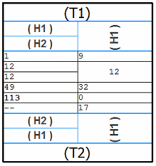
Merge vertical cells with same value
When two adjacent table cells in the same column have the same value, merges the two cells vertically and displays a single value.
Example:
Column 1 shows unmerged data cells. Column 2 shows merged data cells.
|
Column 1 |
Column 2 |
|
9 |
9 |
|
12 |
12 |
|
12 |
Note:
This option does not merge cells when the following check box also is selected on the General tab: Wrap table data cells to new row.
Format Cells
Opens the Format Table Cells dialog box for you to specify the alignment of all data cells in the currently selected column.